Overlay
The resources/js/Components/Overlay directory contains Vue components that have some kind of overlay functionality, like the ones listed below.
AppConfirmDialog
The AppConfirmDialog Vue component is a modal component generally used to confirm destructive actions, such as deleting content in your application. It is designed to enable the user to confirm or cancel the action with minimal effort in your Vue component. It can be used as follows:
<AppButton
    class="btn btn-destructive"
    @click="confirmDelete(route('customer.destroy', customer.id))"
>
    Delete Customer
</AppButton>

<AppConfirmDialog ref="confirmDialogRef"></AppConfirmDialog><script setup>
import { ref } from 'vue'
const confirmDialogRef = ref(null)
const confirmDelete = (deleteRoute) => {
confirmDialogRef.value.openModal(deleteRoute)
}
const customer = { id: 369 }
</script>Note that in the example above, the customer.id is hard-coded for demonstration purposes. However, in a real application, you generally have an array of customers, use a v-for loop, and pass the customer.id to the confirmDelete method.
The rendered result will be (click on the button to open the confirmation modal):
TIP
When the user confirms the deletion action in the AppConfirmDialog window, a DELETE request is automatically sent to your backend. In the example above, the deleteRoute will be /customer/369. By default, after the deletion, the user will be redirected to the index page of the Module in context (in this example, the Customer module), accompanied by a success toast message to provide visual feedback to the user.
AppConfirmDialog Exposed Methods
| Method | Arguments | Description |
|---|---|---|
openModal | The route path to send a DELETE request if the user confirms the delete action (for example: '/customer/369') | Opens the AppConfirmDialog modal. |
AppModal
The AppModal Vue component is a modal component that can be used to display any type of content in a consistent way. It can be used as follows:
<AppButton class="btn btn-primary" @click="openModal">
    Open Modal
</AppButton>

<AppModal :is-modal-open="isModalOpen">
    <!-- Modal header -->
    <template #header>
        <div
            class="flex items-center justify-between rounded-t border-b border-skin-neutral-6 p-5"
        >
            <h3 class="text-xl font-semibold lg:text-2xl">Header</h3>
            <AppButton
                class="btn btn-neutral btn-icon"
                @click="closeModal"
            >
                <i class="ri-close-line h-5 w-5"></i>
            </AppButton>
        </div>
    </template>

    <!-- Modal body -->
    <template #body>
        <div class="space-y-6 p-5">
            <p class="text-base leading-relaxed">
                You can put any content here...
            </p>
        </div>
    </template>

    <!-- Modal footer -->
    <template #footer>
        <div
            class="flex items-center justify-end space-x-2 rounded-b border-t border-skin-neutral-6 p-5"
        >
            <AppButton class="btn btn-primary" @click="closeModal">
                Ok, got it!
            </AppButton>
        </div>
    </template>
</AppModal><script setup>
import { ref } from 'vue'
const isModalOpen = ref(false)
const openModal = () => {
isModalOpen.value = true
}
const closeModal = () => {
isModalOpen.value = false
}
</script>The rendered result will be (click on the button to open the modal):
AppModal Props
| Name | Type | Default | Description |
|---|---|---|---|
backdropClasses | String | 'bg-skin-neutral-9 bg-opacity-75 fixed inset-0 z-50' | The classes applied to the modal backdrop. |
placement | String | 'center' | The placement of the modal content, can be center, top, bottom, left, right, top-left, top-right, bottom-left and bottom-right. |
isModalOpen | Boolean | false | The current state of the Modal. |
AppModal Slots
| Name | Description |
|---|---|
header | The content of the modal header. |
body | The content of the modal body. |
footer | The content of the modal footer. |
AppSideBar
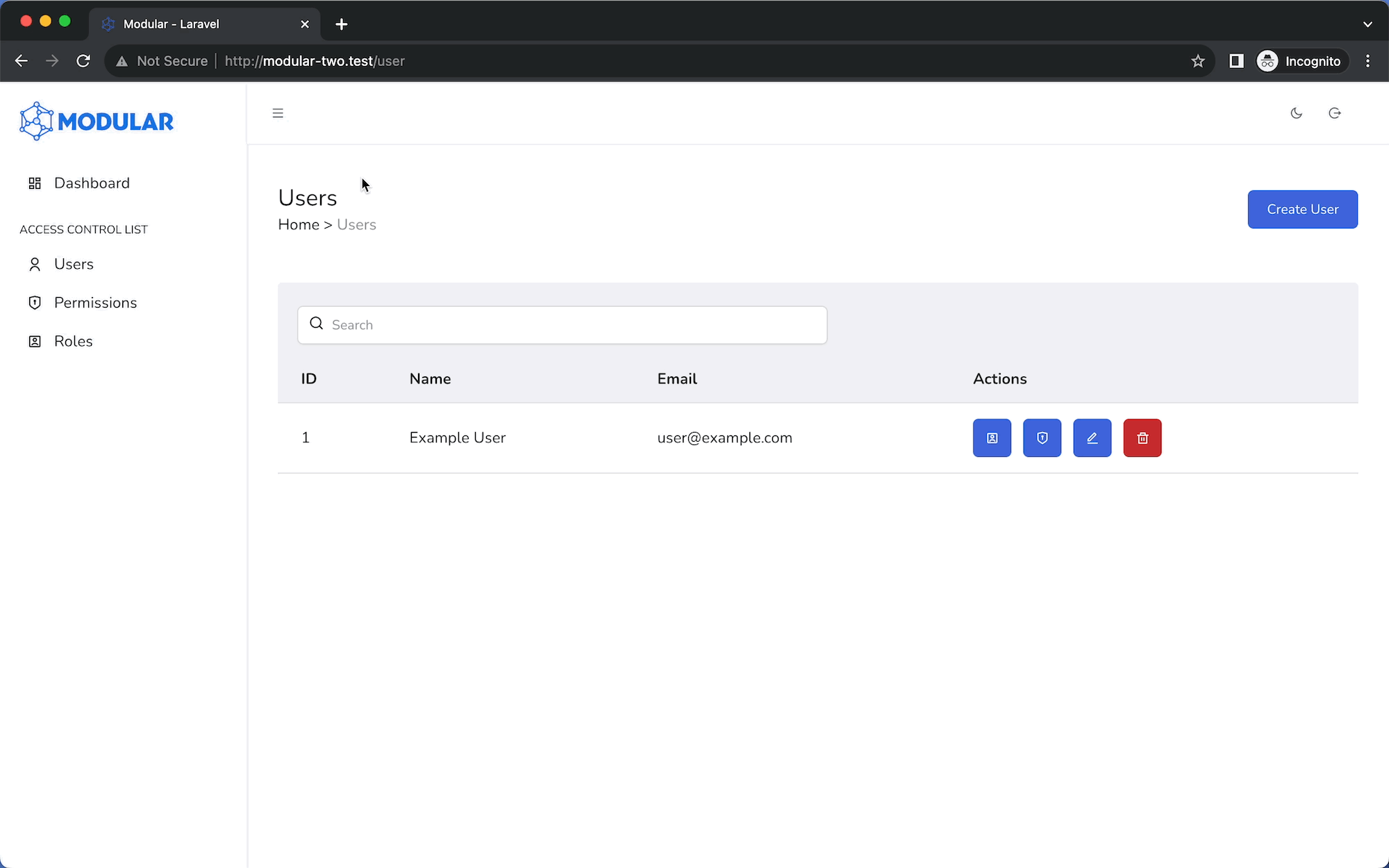
The AppSideBar Vue component wraps around the AppMenu within the AuthenticatedLayout component. It allows users to open or close the sidebar using the hamburger button located in the top left corner of the interface. See the image below for reference:
AppSideBar Props
| Name | Type | Default | Description |
|---|---|---|---|
placement | String | 'left' | Determines the sidebar's position. Options: 'left' or 'right'. If set to 'right' the AuthenticatedLayout must be updated to accommodate the changes. |
bodyScrolling | Boolean | false | Controls whether main content can be scrolled when the AppSideBar is open. |
backdrop | Boolean | false | Controls the visibility of the backdrop when the AppSideBar is open. |
startsVisible | Boolean | true | Sets the initial visibility of the AppSideBar at component mount. Visible if true, hidden if false. |
AppSideBar Slots
| Name | Description |
|---|---|
default | The content of the AppSideBar. |